
Data Entry
Data Entry Card
Data insert and modify can be done using the Data Entry Card
Let’s see for example the laboratory archive so we can take a look at the Data Entry Card.
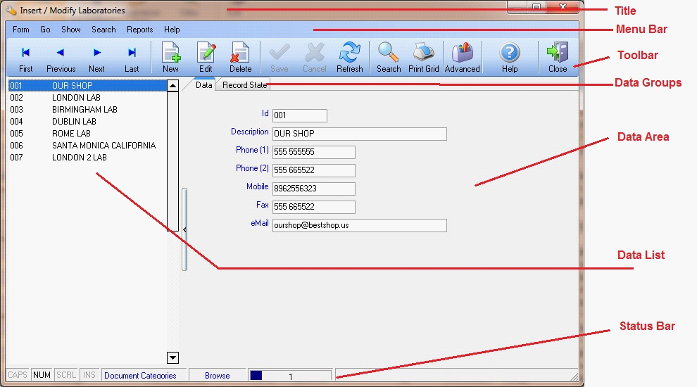
The window is divided in several area called:
-
Title. Tells us what archive we are working on
-
Menu Bar. Contains all the fuctions that can be used for inserting, modifying and managing data. Some of these procedures can be also activated using shortcuts if you don’t want to use mouse and keyboard. If available shortcuts are shown during menu navigation.
-
Toolbar. Contains commonly used procedures for inserting, modifying and navigation of data. It is basically a subset of Menu Bar procedures.
-
Data Groups. If necessary data fields are divided in groups in order to make more simple browsing between them. Each group can be accessed by clicking the corresponding label.
-
Data Area. In this area of the window you can find the data fields of the card.
-
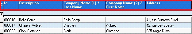
Data List. In this area you can find records that have already been inserted in the archive. A list of one or more important fields for the archive you are working on is shown. In the example for the laboratory archive the software shows Id and Description.
-
Status Bar. Some general information are shown:
-
Keyboard. Keys status in the keyboard
CAPS - Caps Lock
NUM - Num Lock (o Bloc Num)
SCRL - Scroll Lock
INS - Insert / Substitution of characters when typing
-
Archive. Archive Name
-
Card Status. Status of current card, that can be Browse, Insert or Edit
-
Position. Position of current card compared to the total number of records in the archive
-
Messages. In this area can be shown messages for the user while inserting or modifying

Toolbar
 First First |
Moves to first card in the archive
|
 Previous Previous |
Moves to the card preceding the one actually shown
|
 Next Next |
Moves to the card following the one actually shown
|
 Last Last |
Moves to last card available in the archive
|
 New New |
Inserts a new card
|
 Edit Edit |
Modifies the card shown
|
 Delete Delete |
Deletes current card, a confirmation is required anyway
|
 Save Save |
This button is active only when the status of the card is Insert or Edit, updates current card or saves it in the archive if it’s a new one
|
 Cancel Cancel |
This button is active only when the status of the card is Insert or Edit, discards all the changes done to the card from last save
|
 Search Search |
Opens the search form
|
 Refresh Refresh |
Reloads the archive to update changes done by other users
|
 Grid Grid |
Prints the grid (Select Show – Grid first)
|
 Advanced Advanced |
Activates grid advanced mode (Select Show – Grid first)
|
 Close Close |
Closes the window
|
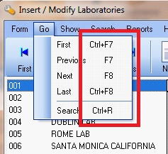
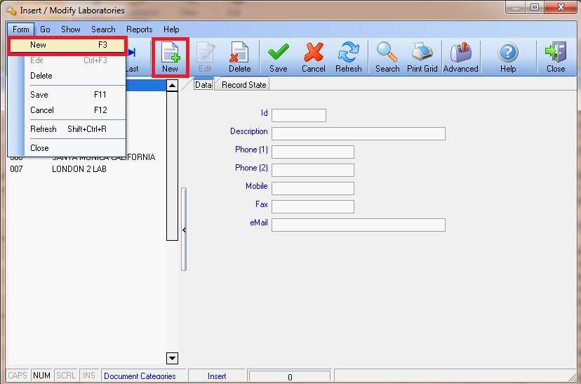
Inserting a new record
To insert a new record select the menu Form – New, or you can press the button New on the Toolbar, or you can use the shortcut F3  .
.
.
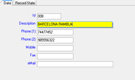
You can now proceed inserting data in the Data Area.
The field you are positioned on is shown with yellow background.
To move on another data field you can use the mouse or the keyboard. If you choose keyboard use keys:
 TAB To move to the next data field
 INVIO (o ENTER) To move to the next data field
 + SHIFT + TAB To move to the previous data field
Once you finish inserting a new laboratory you can use the menu Form – Save or press the button Save on the Toolbar to save inserted data.
Instead if you want to cancel data inserted you can use the menu Form - Cancel or press the button Cancel from the Toolbar.
Menus Save and Cancel and corresponding button on the Toolbar are activated only when the status of the card is Insert or Edit, otherwise they are disabile and will be greyed.
 Buttons disabled
 Buttons enabled
Modifying a record
To modify an existing record select the menu Form – Edit, or you can press the button Edit from the Toolbar, or you can use the shortcut CTRL + F3  + .
+ .
+ .
Once the changes are complete you can use the menu Form – Edit or you can press the button Edit from the Toolbar to save inserted data.
Instead if you want to cancel data inserted you can use the menu Form - Cancel or press the button Cancel from the Toolbar.
 |
You can modify data in a card only when the status of the card is Insert or Edit.
Unless a different configuration, it won’t be possible modify data in a card without pressing the button Edit.
|
Deleting a record
To delete an existing record select the menu Form – Delete, or you can press the button Delete from the Toolbar.
The software always asks for a confirmation from the user before actually deleting a card.
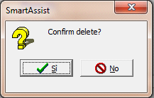
|
|
In some circumstances the software can prevent you from deleting some data to mantain data integrity.
For example it may not be possible to delete a city if it is linked to a Customer Card of a Provider Card.
We recommend maximum attention from the user before proceede deleting data from the archives.
|
Managing Grids
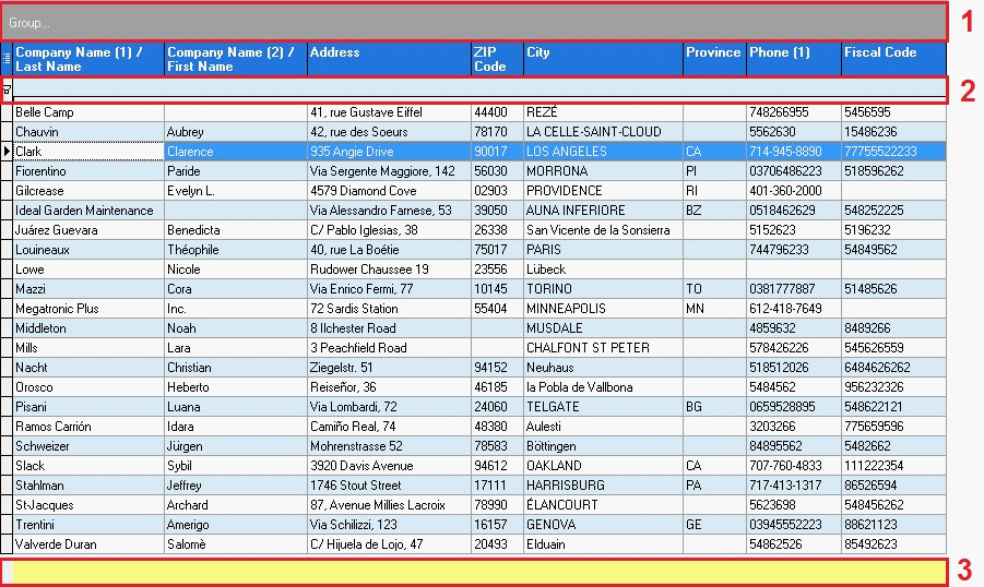
Grids are a quick, powerful and flexible tool to show data.
Let’s take a look for example at the Customers List and show the grid.
The first row of the grid shows the field names
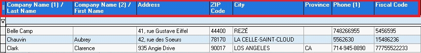
Each column is a data field, in the example of the Customers List you can see First and Last Name, Address, ZIP Code, City, Province, Phone Number.
Each row represents the card (record) of a customer. To help the reading of the grid, the colors of the rows can be different between odd rows (white) and even rows (cyan) simulating the so called easy reading.
The card you are positioned on is indicated by a black arrow on the left  and by a different row layout
  .
.
and by a different row layout .
Standard Mode and Advanced Mode
The grid can be in standard mode or advanced mode.
Standard mode is quicker to load and allows you to resize columns, move columns modifying the visualization order and to show or hide columns.
Advanced mode has all the functionalities of standard mode and also allows you to change the sorting of the data, apply filters to show only a few rows and group columns.
To switch to advanced mode you only have to press the button Advanced  e verranno visualizzate
e verranno visualizzate-
The grouping bar (1)
-
The filter bar (2)
-
The summary bar with totals (3)
Resize columns
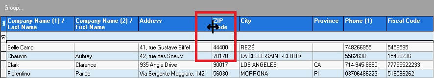
To resize a column move the mouse pointer over the separation line with the following column until the pointer changes, then holding down the mouse left button move left or right until the column has the desired size.
Move columns
Positioning the mouse pointer over the column header and holding down the left button you can drag and drop the column into a different position.
Searching inside the grid
Clicking on the first row of the column of the data field you want to search for, start typing a string to search and the cursor on the grid will move on the first row satisfying the search criteria.
Show or hide columns
Clicking on the button at the top left corner of the grid  will show a cascade list like the one shown in the picture, where you can choose the columns that you want to be shown in the grid.
will show a cascade list like the one shown in the picture, where you can choose the columns that you want to be shown in the grid.
Shown columns are marked with the selection check (  ),the hidden ones instead are blank (
  ).
).
),the hidden ones instead are blank ( ).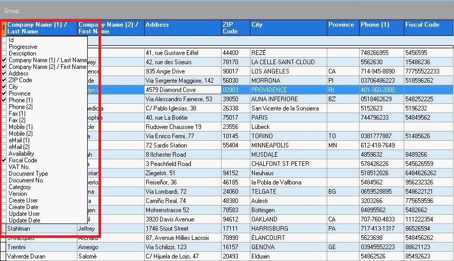
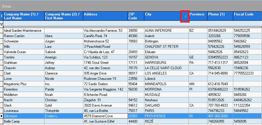
Sorting Data (Advanced Mode)
At the opening of a grid data are shown based on a order set on the software by default. It is possible to change this order just clicking on the column header of the data field you want to order by.
Clicking multiple times switches alternately from ascending to descending order, this can be seen looking at the little arrow on the right side of the column header which will be facing upwards (ascending order) or downwards (descending order).
It is possible to order the rows of the grid only by one column at a time.
In the example shown in the picture customers are ordered by City with ascending order.
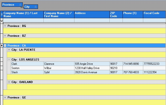
Grouping Columns (Advanced Mode)
Positioning over a column header and holding down the left button of the mouse, you can drag and drop a column on the Group Bar of the columns, marked with the label Group…

It is possible to group grid rows by one or more columns
In our example in the picture customer are grouped by Province and City
Filtering data (Advanced Mode)
It is possible to show on the grid only a subset of the archive applying filters on one or more data fields of the grid.
There are 3 ways to apply a filter:
-
Select the values for each column
-
Use the Filter Row
-
Use the Filter Mask
Filtering data using columns (Advanced Mode)
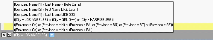
Moving the mouse pointer over a column, like City for example, a little button will appear  with an icon representing an arrow facing downwards. Clicking on the button will show a list of all the values of the field City in archive.
with an icon representing an arrow facing downwards. Clicking on the button will show a list of all the values of the field City in archive.
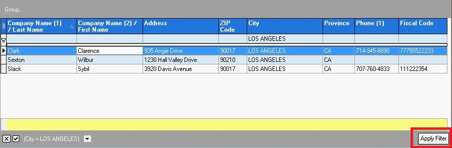
Now let’s suppose we want to filter the customers list showing only those living in Los Angeles, just select the city LOS ANGELES marking it with the selection check ( ).
).
With this selection mode it is possible to select more than one value, like for example Los Angeles, Genova and Harrisburg.

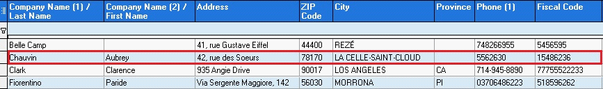
Filtrare i dati con la riga del filtro (Modalità Avanzata)
A second option is to use the Filter Row. The filter row is the second row of the grid, under the headers with field names, it is visible only in Advanced Mode and is marked with symbol  .
.
.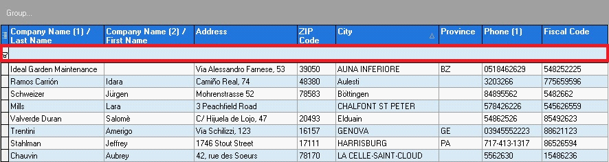
Typing inside the Filter Row and pressing the key Enter to move to the following column, the selected filter is applied. In the example are shown only the customers living in the City of Los Angeles.
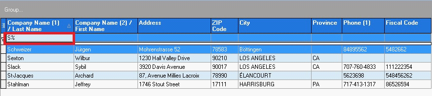
It is possible to filter data searching partial words using special characters
-
The special character % (percentage) allows the substitution of parts of a word
-
The special character _ (underscore) allows the substitution of a single character
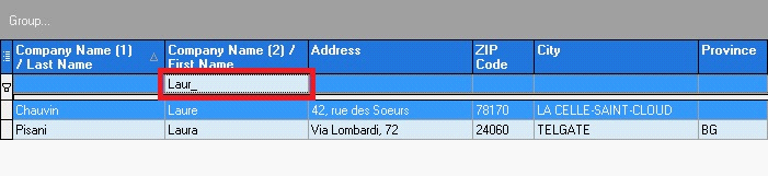
For example if we want to search all the customers whose Last Name starts with S we only need to filter the grid with the string S%
In the same way you can look for all the customers whose Last Name ends with S (%S) or whose Last Name contains the word SE (%SE%)
Instead if you want to search for all the customers whose First Name is 5 letters long and starts with the word Laur not caring what the final letter is, you can filter with the word Laur_
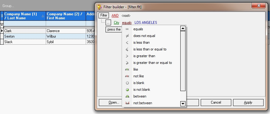
Filtering data using the filter mask (Advanced Mode)
When a filter is applied, a button on the botton right corner becomes visible and you can click n it to apply an advanced filter where you can apply more conditions to more data fields, this filter can be saved so that it can be applied later without having to set it all again
You can apply all the combinations of these search modes to filter data in the grid.
Filters summary (Advanced Mode)
At the bottom left corner of the grid there is a filters summary.
Using the filters summary you can activate, disable and view created filters during the work session.
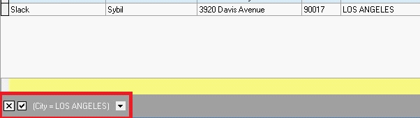
If activated it shows the active filter, in the example is activated a filter on the City of Los Angeles.
It is possible to temporary disable the active filter clicking on the first checkbox
( ) on the left of the description of the filter, so you can reactivate it again later if necessary.
) on the left of the description of the filter, so you can reactivate it again later if necessary.
It is also possible to cancel the filter clicking on the second checkbox ( ) on the left of the filter description.
) on the left of the filter description.
It is also possible to view the filters that have been activated during the work session by clicking the button with a downwards arrow on the right of the filter description.
Selecting the filter from the list, it will be reactivated.
Once the window is closed, all the activated filters are deleted from memory.
Grids popup menù
Grids popup menu is activated by right-clicking on the grid with the mouse
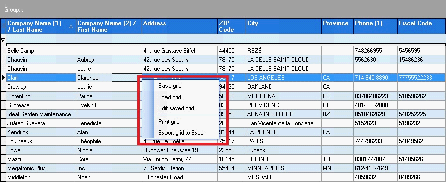
Through the popup menu it is possible:
-
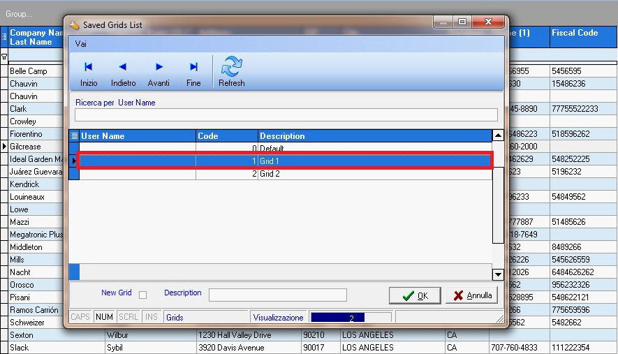
Load a saved grid
-
Save the actual grid configuration
-
Save the actual grid configuration as a default
-
Print the grid
-
Export the grid to an Excel file
-
Export the grid to a text file
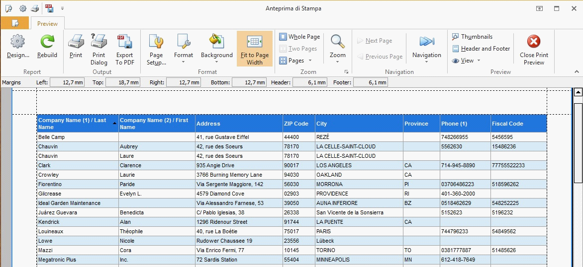
Print the grids
Using the popum menu Print Grid it is possible to print data as they are shown at the moment.
Only rows and columns visible at the moment of the print will be printed, so if there are active filters only filtered data will be printed and if there are grouped columns they will be maintained in the print.
Before printing on paper, a preview is shown so you can configure print parameters.
Exporting grids to Microsoft ExcelTM
Using the popup menu Export grid to ExcelTM it is possible to save data shown in the grid to an Excel worksheet.
Select the folder where you want to save the data and the filename you want to assign them.
As it happens when you print the grid, only rows and columns visible at the moment of the export are saved into the Excel file, so if there are active filters only filtered data will be printed and if there are grouped columns they will be maintained in the Excel file.
Save ccustom grids
Once you have customized a grid resizing, sorting, hiding or showing columns it is possible to save such configuration through the popup menu Save grid.
The first time the grid is saved as a default and automatically loaded every time the archive is shown.
Later it is possible to save other grid configurations selecting the checkbox New Grid and choosing a name for the grid to save.
Later it is possible to save other grid configurations selecting the checkbox
New Grid and choosing a name for the grid to save.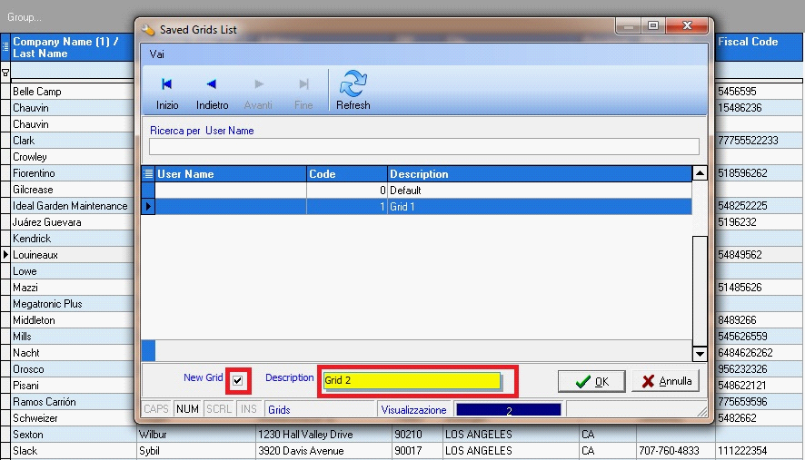
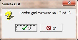
It is also possible to overwrite a saved grid selecting it from the list without selecting the checkbox New Grid.
The software asks for a confirmation of the operation.
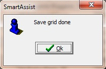
Once the file have been saved, a message appears to notify the end of the operation.
Load custom grids
Once you have many grid configurations saved, it is possible to load them through the popum menu Load grid…
Basically it is possible to configure one or more custom visualization mode for each grid, set a default visualization and load whenever you want other visualization modes previously saved.
